While I do own a DLSR camera, I find myself often too busy to actually use it. Lugging a large camera downstairs to take photos, all while trying to get everything done quickly, isn't super practical with a toddler. For that reason, I often use my iPhone to take photos and then I edit with A Color Story. I wanted to share my process and tips for taking my photos using my iPhone. For beginner bloggers (or really anyone!), it's totally possible to take all your photos with an iPhone--no expensive camera needed!
1. Light Matters

My usually process for taking photos is to get as close to a window as possible, but to avoid any direct sunlight. That means, my bedroom window in the morning or kitchen patio window in the afternoon: I get a good amount of light in these two spots, but because of the direction of the sun, it's not a super harsh direct light. Why should you avoid direct, bright sunlight? It will cast a harsh shadow over your photos that your iPhone camera can't correct and will ultimately make your photos look washed out.
2. Pick a Consistent Background
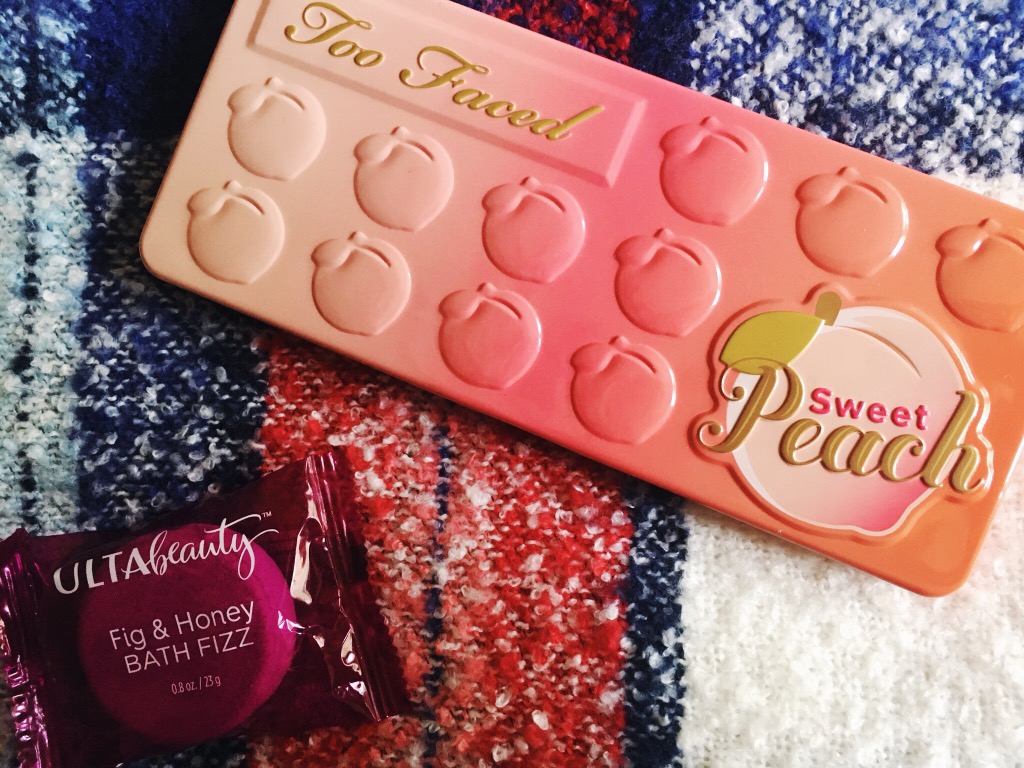
You may notice that I typically use a plaid background for my photos. Why? Mainly, I just like the look of it. While the typical white marble or white fence backgrounds are popular among bloggers, I didn't want to have to go buy a specific prop just for photos. I use my favorite blanket scarf! A lot of why I do this is to have a specific "style" of photo of my own--and also, I know how photos on my favorite background will look and I have worked out a way to do the best editing with this background. To me, this just makes it easier to take photos because I know how to edit them right off the bat.
Some people like all white or solid color backgrounds for this reason, but for me, the plaid helps me angle things in a way that I like.
3. Use an Editing App

As I mentioned, I use A Color Story to edit my photos. I find this the easiest app to use, mainly because I love the look of A Beautiful Mess's photos and their filter packs are affordable and really good for a variety of photos. Below, there is a step-by-step of how I edited the above photo. I took this photo in indirect sunlight outside.


Step 1: I use the Disco Ball filter from the Good Vibes pack at less than 50%. Disco Ball increases the brightness, but doesn't increase shadows; it also makes everything a little "whiter". I like this filter to start out because it evens out the color really well.
Step 2: I use the Palm Springs filter at less than 50% next. It's also from the Good Vibes pack. Just like Disco Ball, it brightens and whitens--but Palm Springs also gives a nice airy, light look to the photo while keeping it very clear. Contrast increases slightly. At this point, I'm just looking to make sure the white in my background is looking white instead of gray or cream.


Step 3: I switch to the Seasons pack. Seasons is a pack you have to pay for, but at only $2.99, it's super affordable and I love these filters! FIrst, I use the December filter at around 50%. December increases contrast and shifts the color to be more blue or neutral (depending on how yellow everything is looking). I love how it punches up greens and blues in photos! This helps my photos look nice and vibrant.
Step 4: I then apply October at less than 50% (I prefer closer to 30%). October is an extra step that I don't always use. It increases red and warm tones (notice how the red looks a little more vibrant and the orange in the leaf is more intense); for this photo, I just felt like it needed the warmth punched up a little more about I applied December.
That's my exact photo process! It's easy to use and play with to get the look you want for your photos.
4. Practice Makes Perfect

There are still times when I don't get photos right. For example, in the photo above, I love the light and contrast--but the white of the scarf still looks gray and dingy; as well, the color of the flowers could be brighter in comparison to the red-black-and-pink tones of everything else in the photo. However, by practicing consistently and working to take better photos, I feel like I am always improving and getting better at my technique.